
Product Photography on White vs. Color: Choosing the Right Image for the Job
Industrial product photography usually starts with a simple question:
What does the product need to do in the image?
Sometimes the answer is straightforward. The product needs to be shown clearly, accurately, and consistently. It needs to work on a website, in a catalog, on a distributor page, or inside a product management system. In those cases, a clean white or gray background usually makes the most sense.
But not every product image has the same job.
Some images need to support a campaign. Some need to work in an ad or a social feed. Some need to give a marketing team more visual flexibility. In those cases, color can be a useful tool — not as decoration, but as a way to give the product more presence and the brand more options.
The key is knowing when to use it.
White and Neutral Backgrounds Still Matter
For most product photography, white and neutral backgrounds are still the foundation.
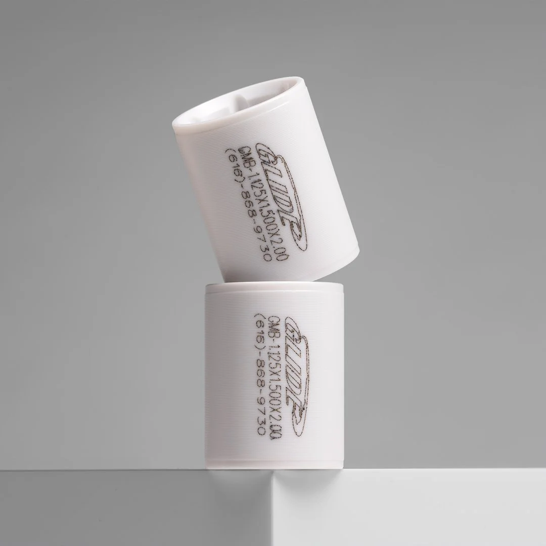
They are clean, flexible, and practical. They keep attention on the product. They make it easier to compare items within a larger line. They work well across ecommerce platforms, catalogs, distributor websites, printed sales sheets, and internal product systems.
For technical and industrial products, that clarity matters. A buyer, engineer, or product manager may be looking for accuracy more than atmosphere. They need to see the shape of a part, the finish of a material, the way components fit together.
That is where neutral photography does its job. It reduces distraction. It creates consistency. It gives the product room to be understood.
And consistency becomes more important as the project scales. When a company has hundreds or thousands of products, the photography has to function as a system. The lighting, backgrounds, crops, and angles all need to hold together across the full set. The files need to be named, organized, and delivered in a way that makes them usable.
At that scale, images are not just individual photographs. They become part of the company's visual infrastructure.
When Color Starts to Make Sense
Color starts to make sense when the image needs to do more than document the product.
A white-background image may be exactly right for a product page, but it may not carry enough presence for every use. A marketing team building assets for social media, digital ads, trade show graphics, email campaigns, or product launch materials needs something different. They often need an image that still shows the product clearly, but gives the brand more visual energy.
That is where color can help. It can create contrast, connect the image to a broader brand system, and give a campaign a stronger visual identity — without changing the product itself.
But it has to be handled carefully. The product still needs to be the subject. The color is there to support the image, not take it over.
Documentation vs. Marketing: They Are Not the Same Image
One of the most useful distinctions in product photography is the difference between a documentation image and a marketing image.
A documentation image answers: What does this product look like?
A marketing image answers: Why should someone pay attention to this product?
Both are useful. Both may be needed for the same product. But they are not always the same photograph, and trying to make one image do both jobs usually means it does neither well.
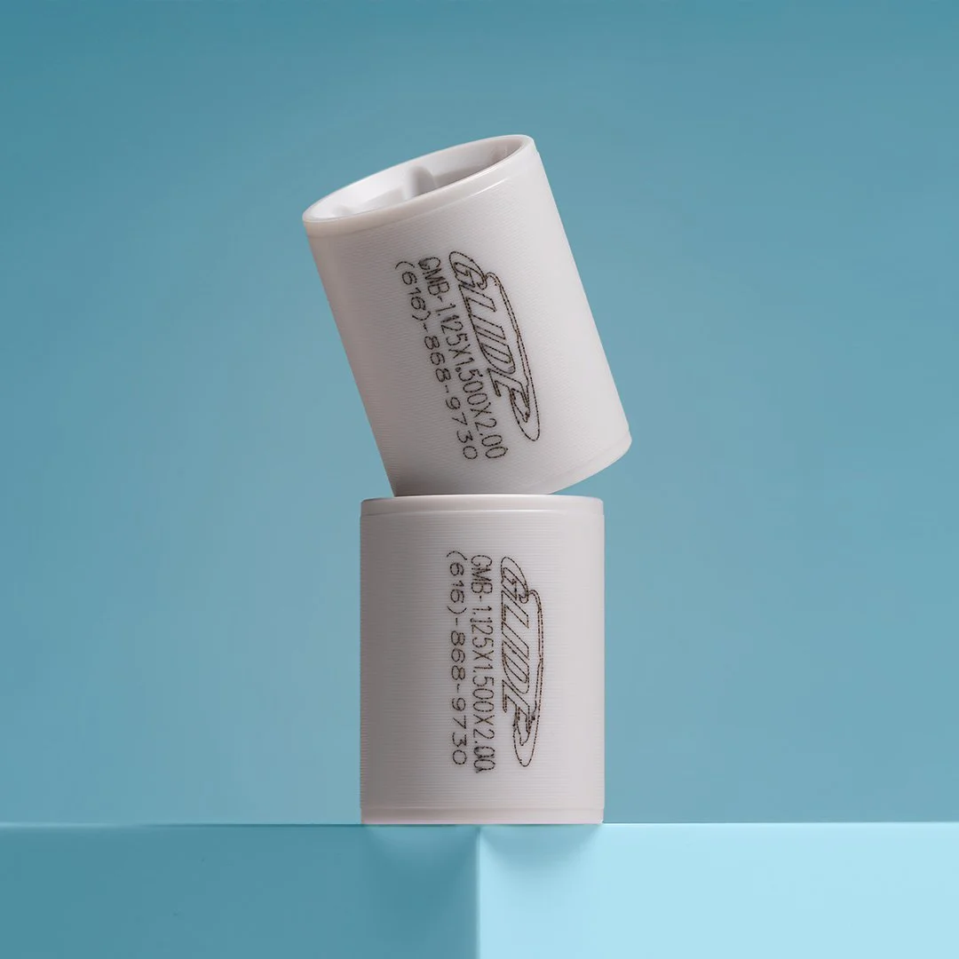
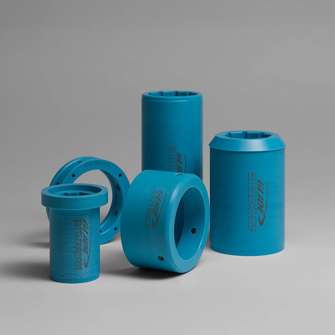
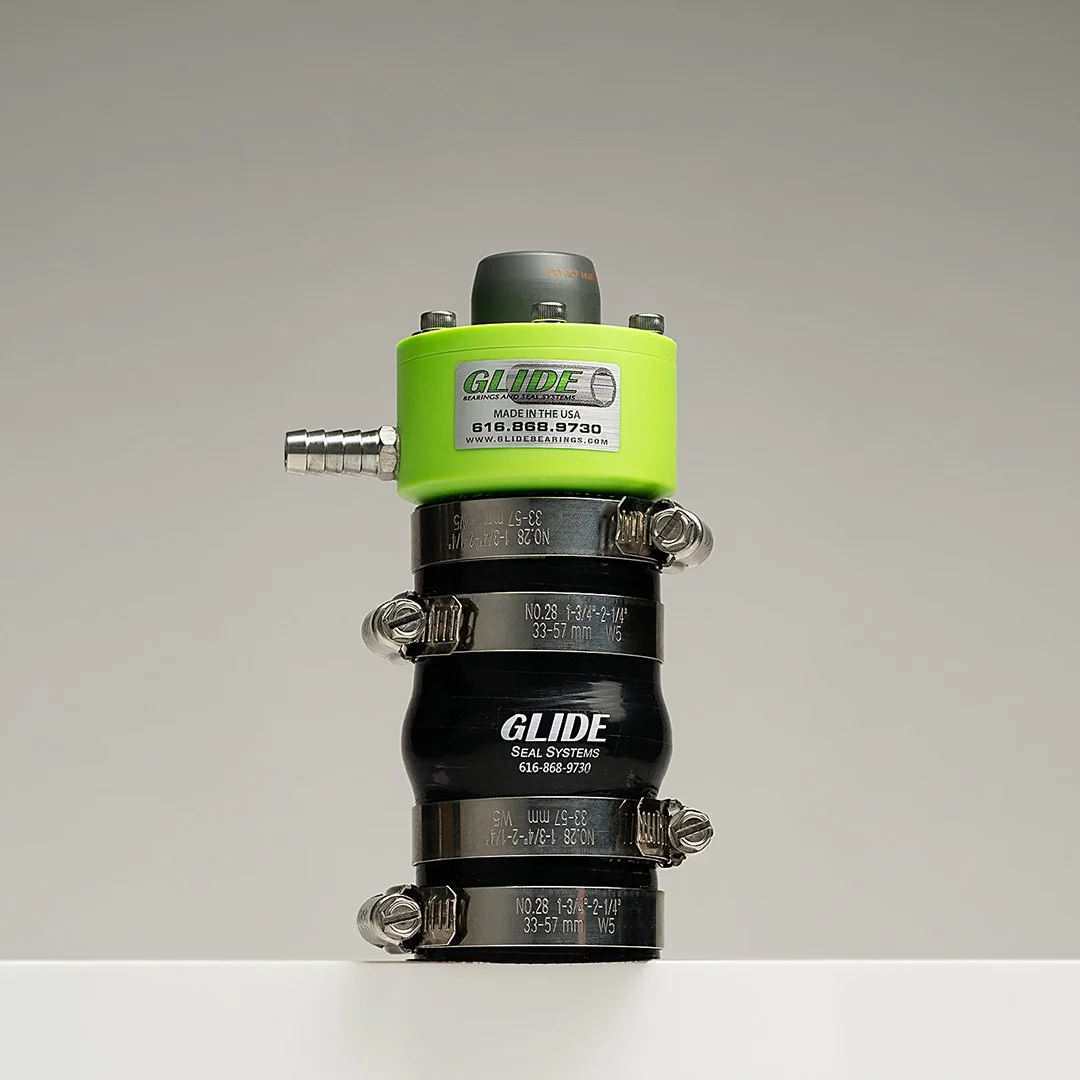
On a project I completed for Glide Bearings & Seal Systems, the deliverables included both. Clean neutral images handled product pages, sales materials, and internal use. A separate set of color-based images gave the brand stronger options for advertising, social media, and campaign work. The creative images were not a replacement for the documentation work. They were an additional layer built around a different purpose.
That distinction is worth thinking through before a shoot, not after.
Color Should Still Feel Intentional
Color adds value when it is connected to the product or the brand in some way. It creates problems when it is not.
If the color distracts from the product, it is not helping. If it makes the material harder to read, it is not helping. If it clashes with the brand or makes the image less useful across real channels, it is not helping.
The strongest uses of color in product photography feel controlled and purposeful — a background that complements the material or finish, a tone tied to the company's visual identity, a version of an otherwise straightforward image built for a specific campaign. The goal is not to make every product image colorful. The goal is to know when color gives the image a more useful role.
Thinking in Image Sets
A single product can need more than one kind of photograph.
One image may need to show the product clearly on white for a product page or distributor listing. Another may need to support a banner, ad, or social post. Another may need to work as part of a broader campaign. That is why I think in terms of image sets rather than individual images — and it is why deliverable planning matters before a shoot, not after.
A strong product photography project considers where every image will live and what it needs to accomplish. A product page, trade show display, email campaign, and paid ad all have different visual requirements. The file formats, crops, background treatments, and color decisions that serve one channel may not serve another.
The best deliverables give a company options without creating inconsistency — clean enough to be practical, intentional enough to be useful, flexible enough to support the brand across product pages, 360° product photography, campaign assets, and long-term catalog growth.
Final Thought
White-background photography and color-based photography are not competing approaches. They serve different purposes.
Neutral images are often the foundation — practical, consistent, flexible across platforms and product systems. Color-based images can add another layer when the work calls for it, supporting campaigns, ads, trade show graphics, and broader brand communication.
The important part is intention. Every product image should be built around where it will be used, who needs to use it, and what job it needs to do. That is what makes product photography more than documentation. It becomes a practical part of how a company presents, organizes, and markets its products.